Lumeni product line packaging and online shop
Lumeni is a coffee and mushroom blend developed in Hungary. Alongside 100% Arabica coffee it contains functional mushrooms, adaptogens and vitamins, and offers more balanced, longer-lasting energy than regular coffee. We designed the packaging for the product line and the visual look of the website. Our aim was a brand identity that makes a new product category, still unfamiliar to many, easy to understand and appealing.
- UX/UI design
- Packaging
- Website development

What was the goal?
The goal was to create modern, eye-catching packaging that feels youthful yet speaks to anyone open to the newest ways of enjoying coffee.
We wanted the brand to grab attention at first glance and be easy to recall later, so the name itself became the starting point for the design.
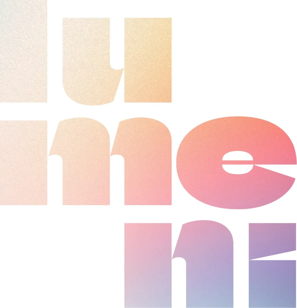
The name Lumeni comes from the Latin word "lumen", meaning light or brightness. This meaning became the basis of the visual concept too: we looked for a distinctive motif that refers to light, energy and the mental freshness the brand stands for, all at once.
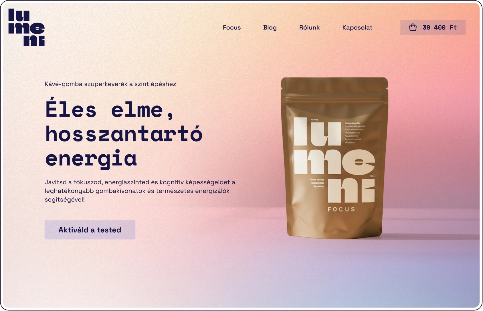
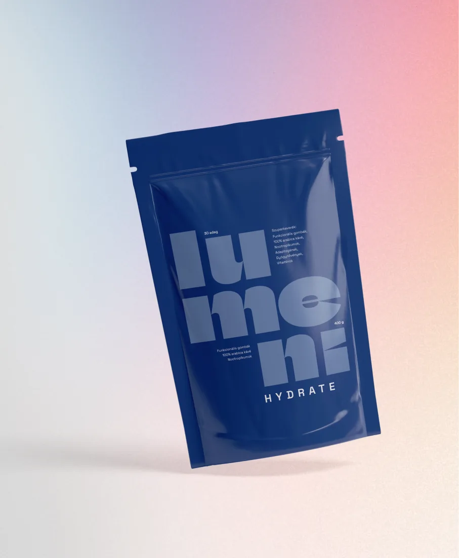
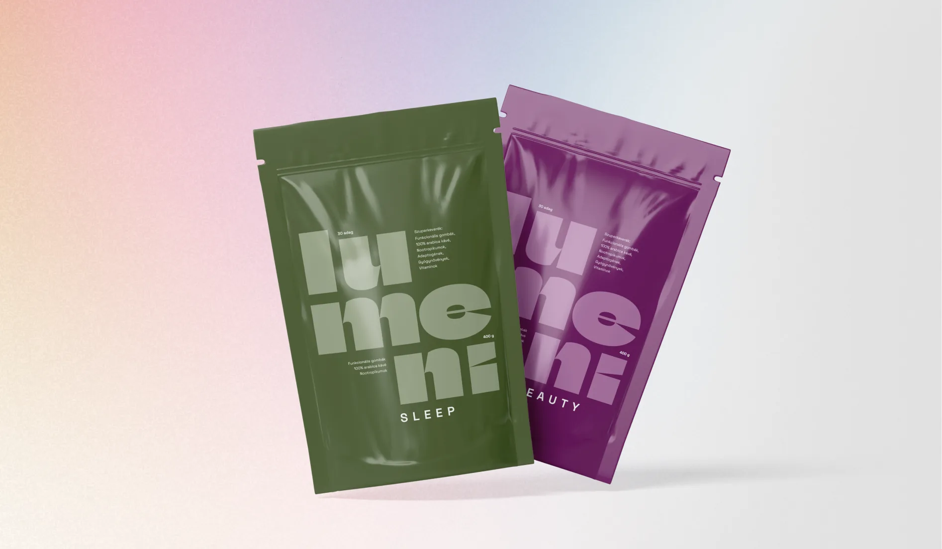
Split into syllables, "lumeni" fills the surface of the pouch in large type, so the packaging is essentially the logo itself. The idea was that this simple, playful solution would help anyone who has come across the product once to recognise it easily later.


What was the challenge?
The biggest challenge was presenting a product many people don't know yet in a way that makes the packaging speak to the target audience and spark curiosity at first glance.
We didn't try to make the pouch tell everything about functional mushrooms and ingredients, but to spark enough interest to prompt shoppers to look it up and learn the details on the website. To do this, we wanted the packaging to be simple and easy to understand, yet exciting.
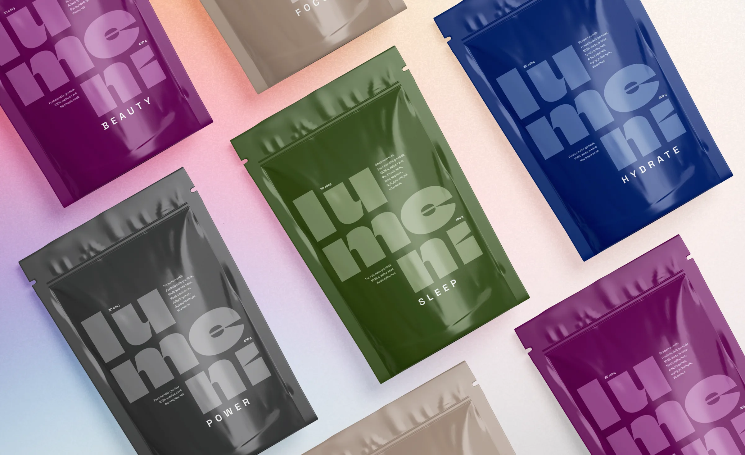
Each variant got its own colour that also tries to reflect the character of the product. The warm, coffee-like mocha brown of Focus, the calm deep green of Sleep, the water-inspired dark blue of Hydrate, the stronger anthracite grey of Power and the plum purple of Beauty help tell the products apart, while the aim was for them to form one family that belongs together.
With lighter typography tuned to the saturated base colours, we wanted to create a calm, harmonious effect, so the packaging is restrained and eye-catching at the same time.
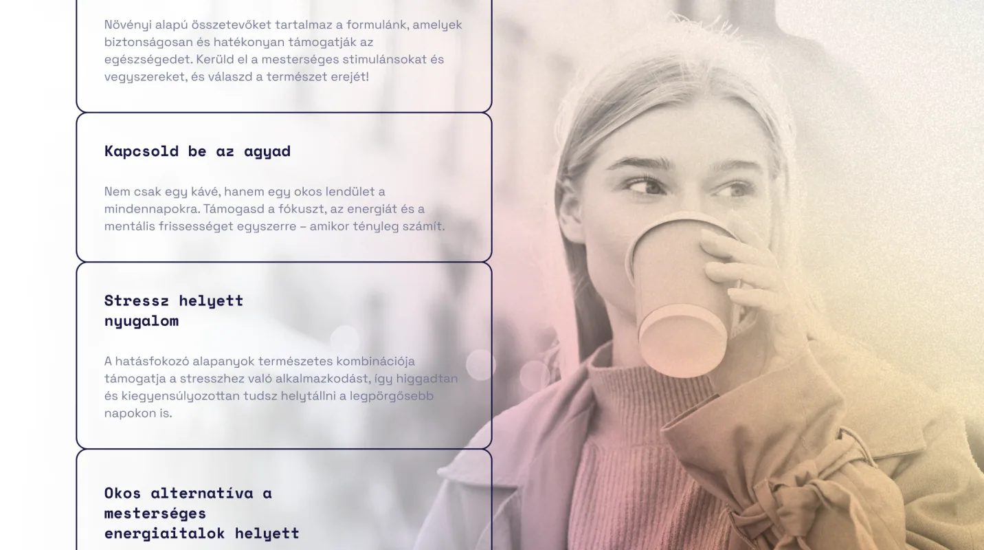
The website
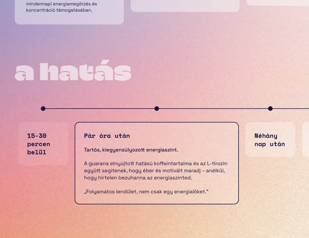
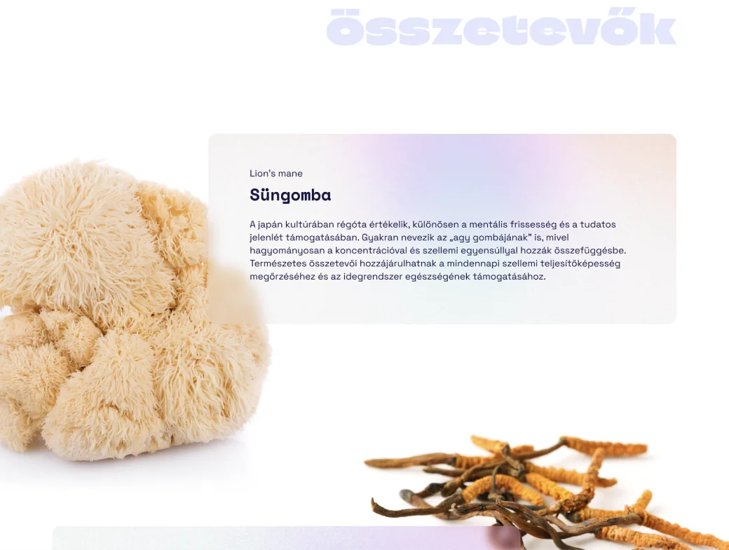
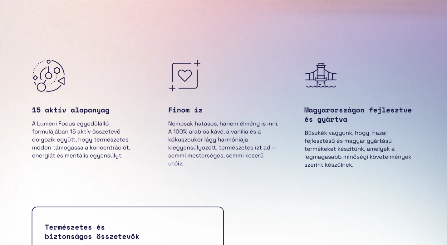
While the packaging was built on simple harmony and catching attention first, the website got a visual world that is in tune with it but far more colourful. If the packaging sparks interest, the website is where visitors can dive into the details: learn about the ingredients, the story of functional mushrooms and how Lumeni came about, and get answers to their questions.
Here, gradients and visual elements play a bigger role, so the burst of colour further builds curiosity about the product and makes the brand friendlier and more lovable.
The aim was for the clean packaging and the richer, more playful website to complement each other and create one consistent experience.


Let's dive in!
Tell us what you need, or simply where your business is stuck right now.
We will get back to you within 2–3 working days with a clear quote covering what we will build, how long it will take and what it will cost. Asking for a quote is free and comes with no obligation.